liviBank - Buy Now Pay Later
Situation
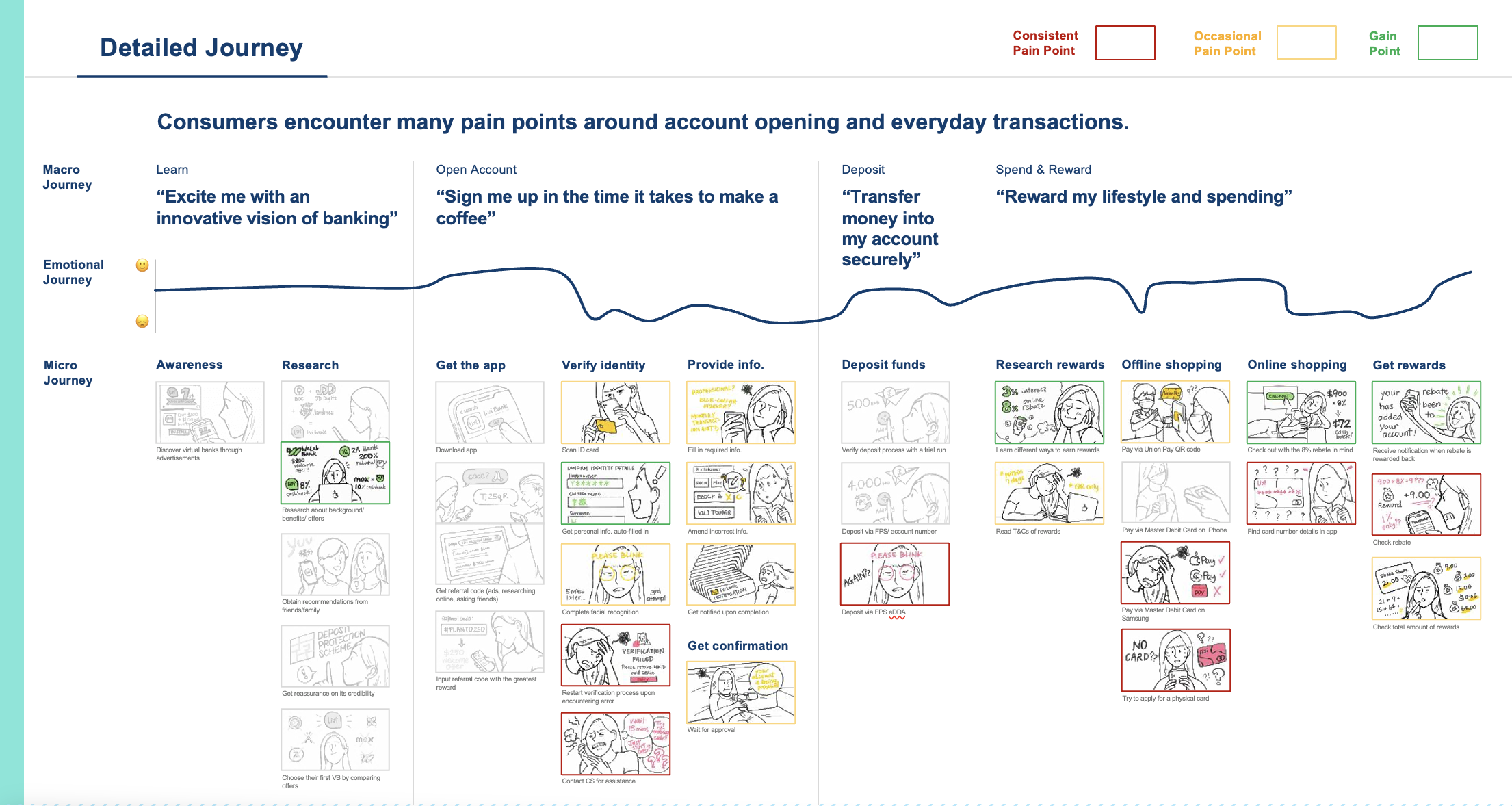
As a UX/UI lead at Livi, a newly established virtual bank, we have a challenge: our NPS is lower compared to other virtual banks in Hong Kong. Our goal is to improve the digital banking experience by understanding consumers' needs and expectations. We want to explore different consumer personas and their varying expectations. We also aim to identify the key differences consumers perceive between traditional banks and virtual banks. Additionally, we want to understand consumers' experiences with virtual banks and Livi, specifically regarding learning, registration, and early usage. By gaining these insights, we can enhance Livi's digital banking experience and provide a more satisfying journey for our users.
Task
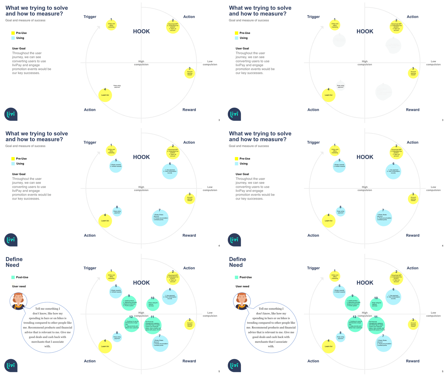
Design a UX hook to incentivize and reward users for their engagement and loyalty within Livi Bank.
Description: my task is to create a compelling UX hook that encourages users to engage with the app regularly and rewards them for their loyalty. The goal is to enhance user retention and create a positive user experience that keeps users coming back to livi Bank and improve livi bank NPS (Net Promoter Score)
Action
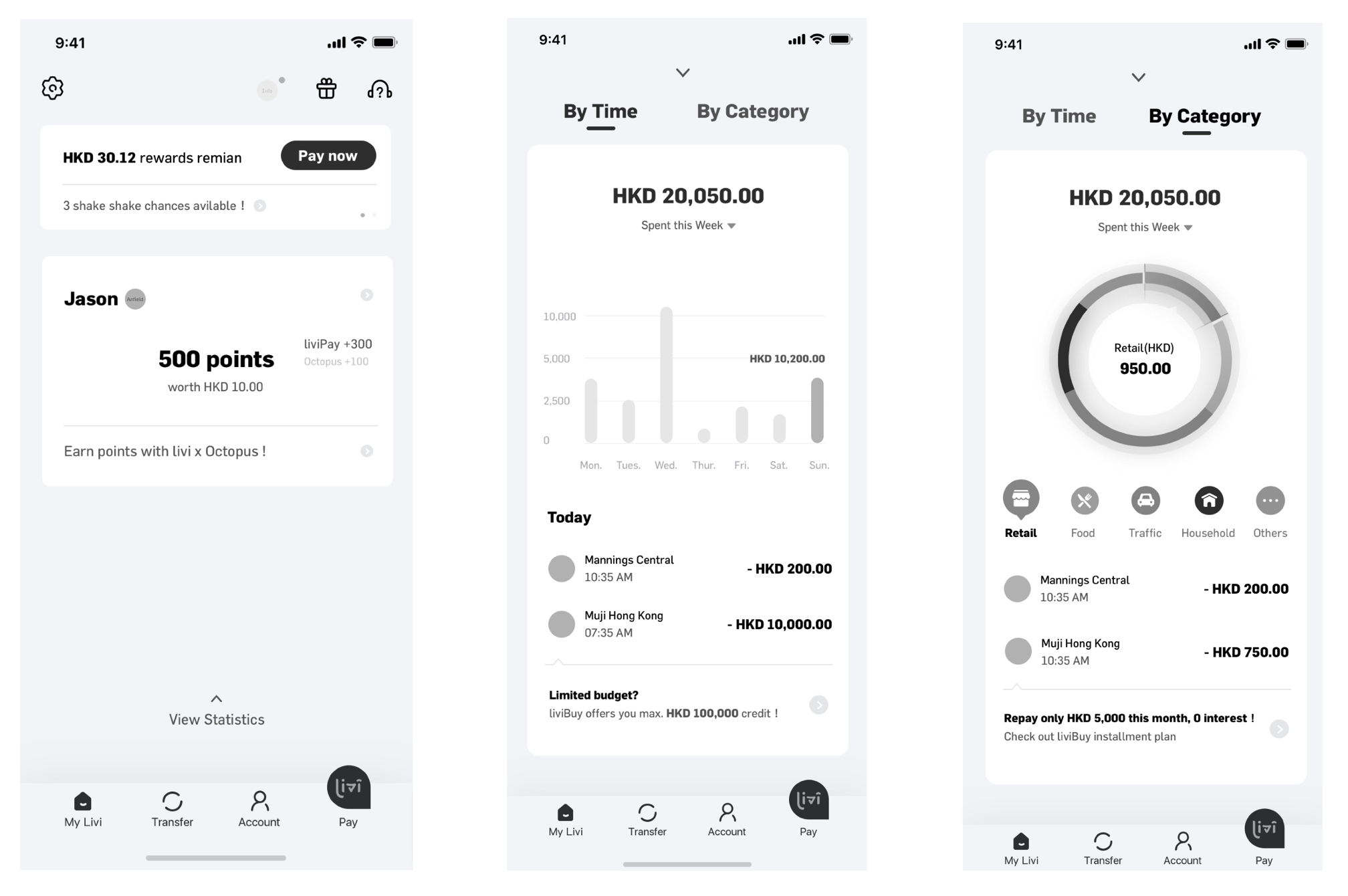
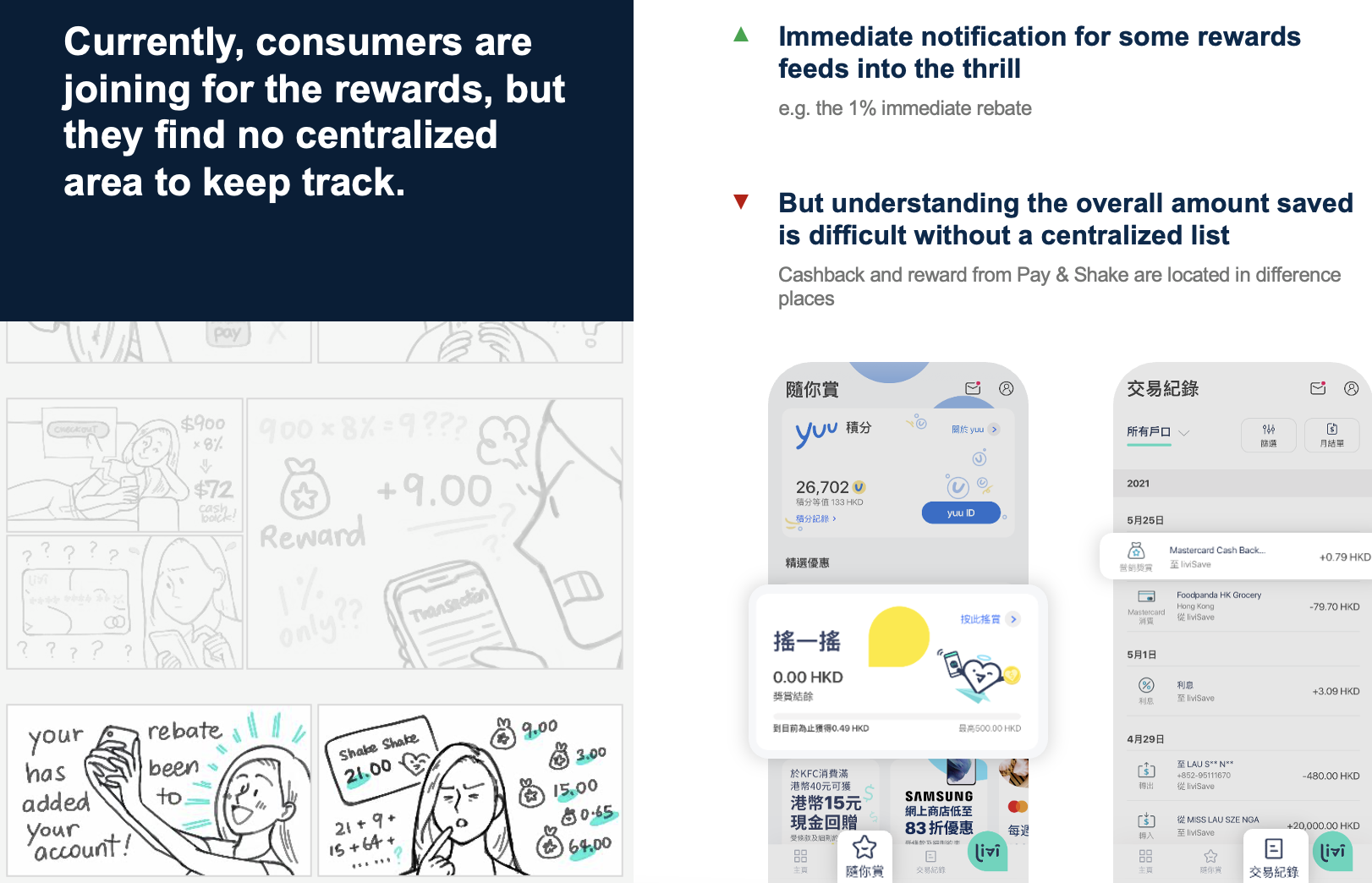
I started by conducting usability tests to identify the main pain points in the checkout process. I then conducted competitor research to see how similar buy now pay later apps structured the process. Based on my findings, I redesigned our process and added Personal Finance Management which provides transaction analytics information. I also implemented a promotion hub as we previously only showed promotion banners.
User Interview: Testers were able to freely express their thoughts verbally
Score rating: Testers were asked to give a numerical rating on the features and functionality of the prototype.
Bring customers’ voices to any stage of product, campaign, or service development...
Mixed Method research
Enabled by 40+ qual and quant tools to obtain customer insights in an interesting & interactive way
Invite selected customers for pilot testing of our new features or services
Friday quick poll
Objective: Understand simple consumer behaviors or perform quick proof of concepts
Format: Short survey
Sample size: n=100
Est turnaround: ~2 weeks
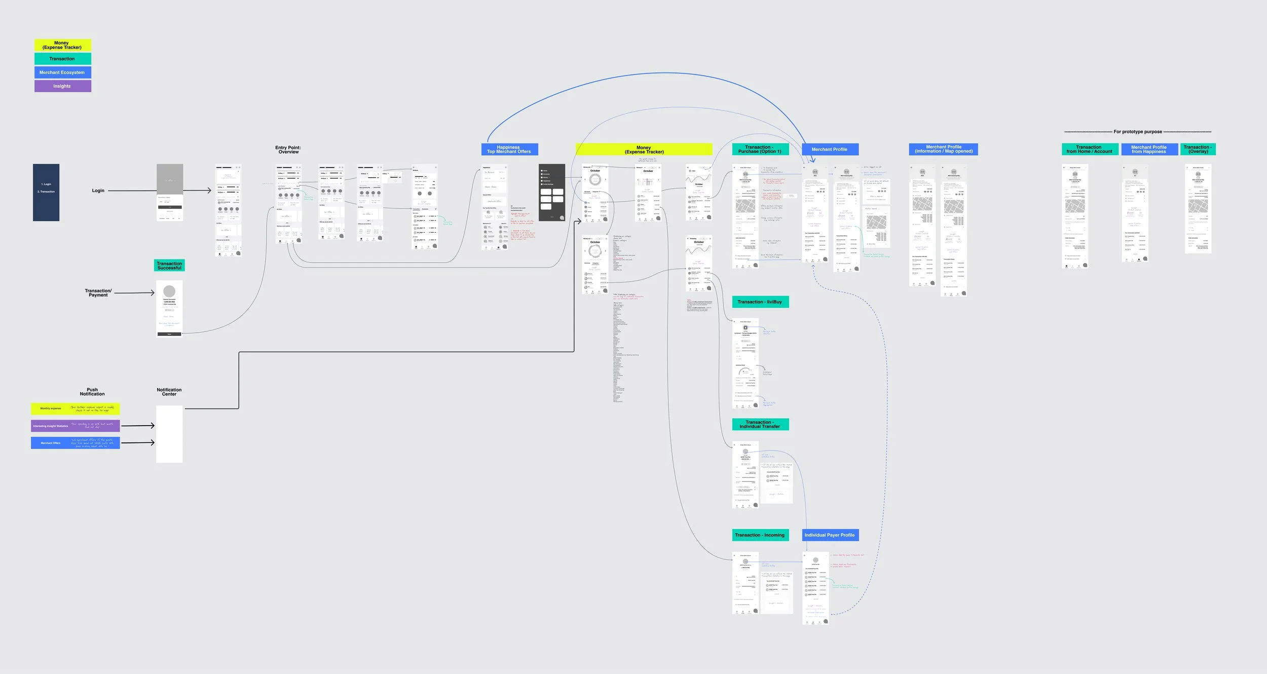
Wireframe ideation
Personal Finance Management Guidance users discover an “Aha” moment. Complete a tour and click the preview button. Let users feel great when they get to their first win.
Ethnography Research for buy now paylater
Challenge
livi’s ambition is to create a unique proposition and banking experience for customers in Hong Kong. This requires the ability to differentiate in many ways from competitors. To explore the possibilities through the design of game-changing features, such as PFM (Personal Financial Management) and Insights.
Solution
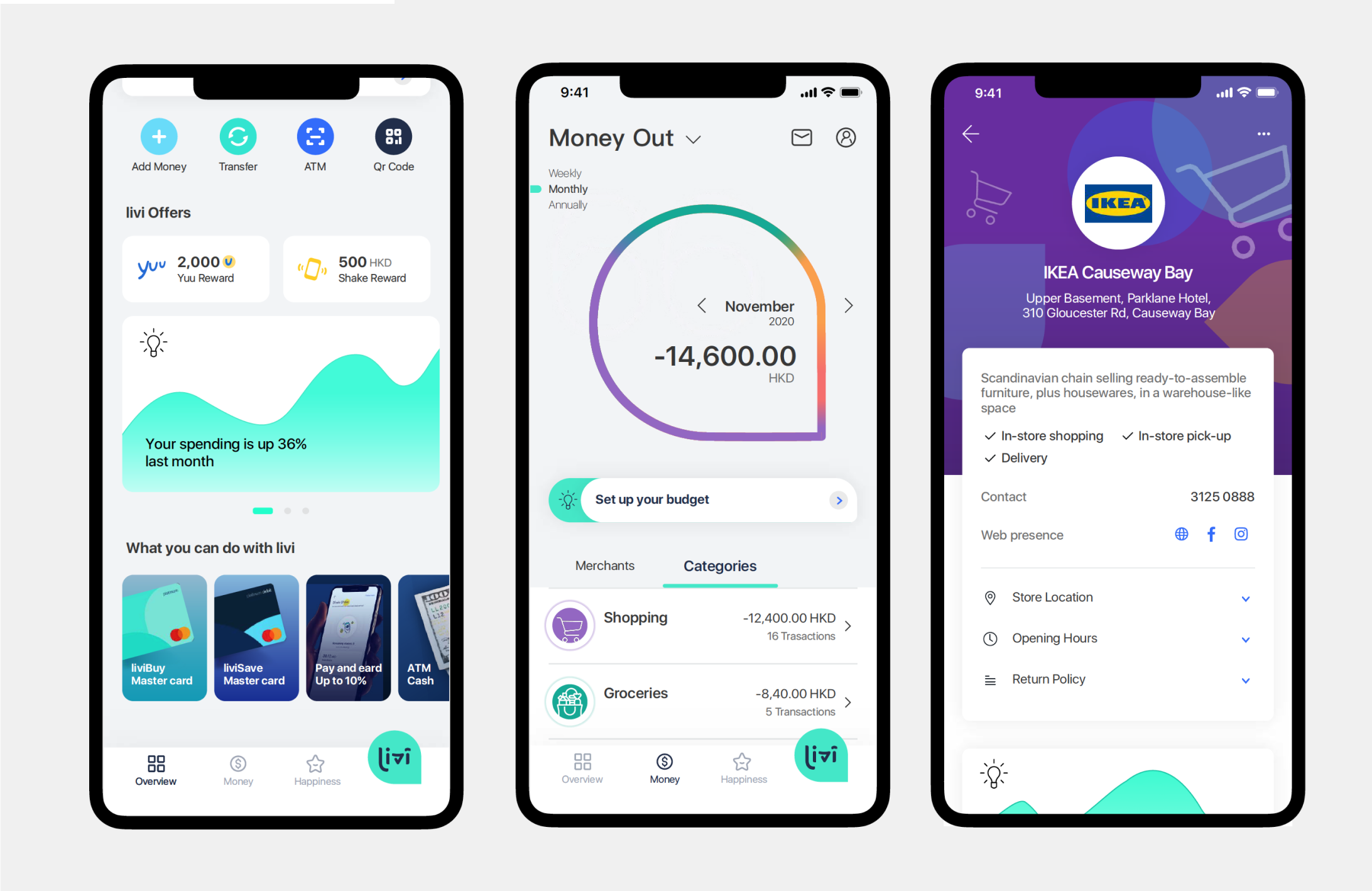
Using the current design system as a basis, we evolved the experience by introducing uniquely branded data visualisation components to show spending by merchants, as well as by categories. The app structure was also revised to accommodate these features. We introduced a section called ‘Money’ into the primary navigation where users could see Money In and Money Out, providing them a full view of all transactional activity. Insights were an additional element which brought intelligent recommendations to customers based on where they were in the experience.
Social feed usability testing, display most updated banking information and user activity
Usability Test: Testers were tasked to navigate through the prototype and asked questions to express their feelings about their process. All answers were documented in video, voice, and written format.
New design make sure user can find their favourite brand and know the promotion offer, hide detail condition in detail promotion page
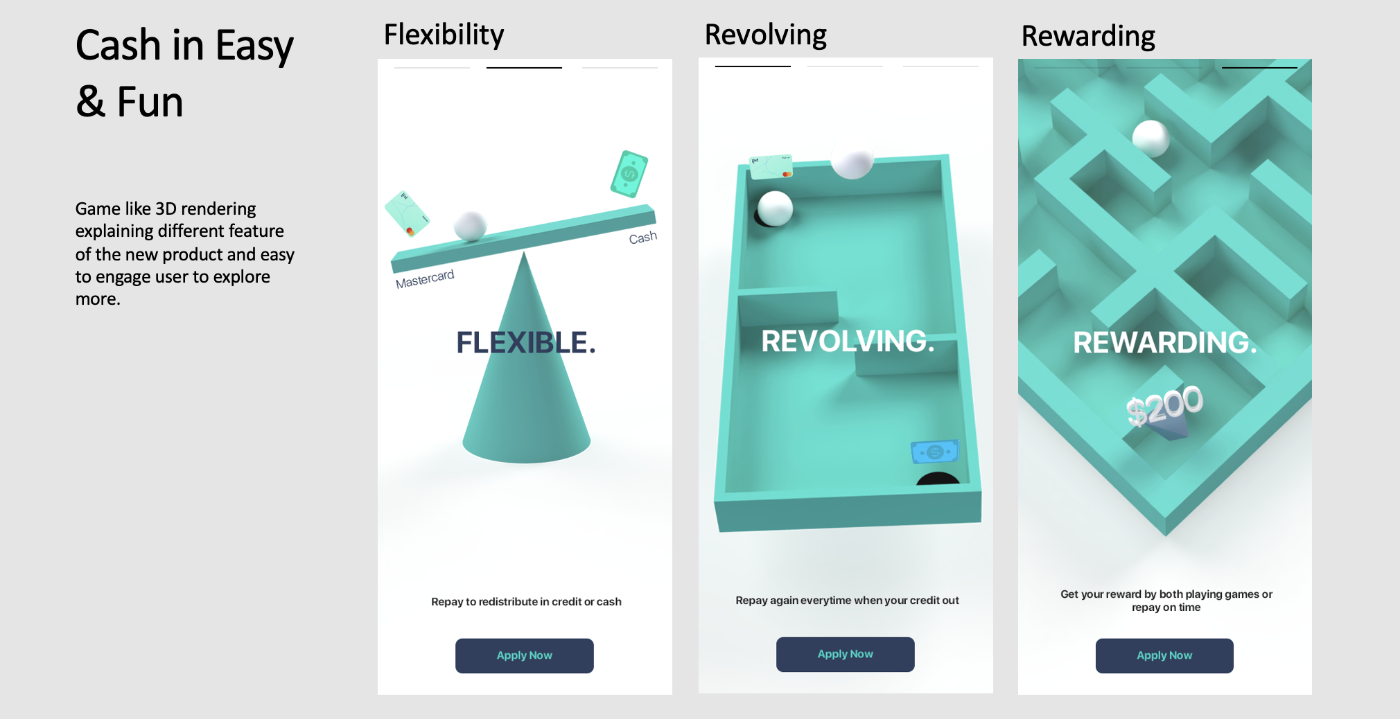
Gamification method to educate user what is BNPL (Buy now paylater)
livi Paylater in-app story introduces product feature
Paylater drop off data tracking by tableau
Results
A month after BNPL, Promotion HUB, and Personal finance management were live, we saw an Overall NPS score increase by 8 points from -9 in the last wave to -1 this wave Cumulatively. The redesign not only improved the user experience of the app but also significantly increased retention.”
livi PayLater (full year NPS 27)


